Mobile Application
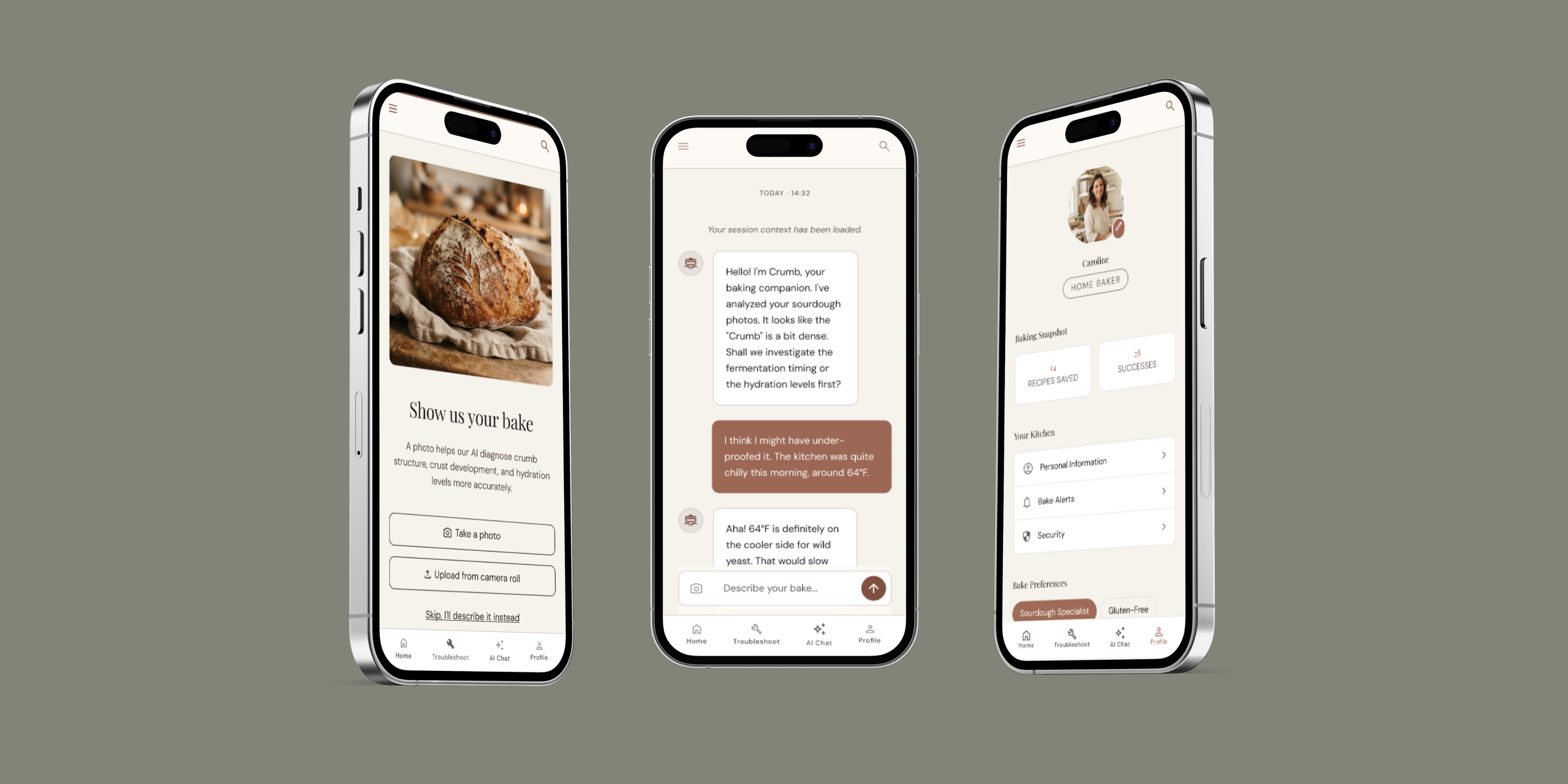
Crumb — AI-powered baking guide
A mobile app to help home bakers troubleshoot with AI-powered feedback.
Overview
This case study documents how I used Claude and Google Stitch to move from a rough concept to a hi-fi prototype, and where human design judgement still mattered at every step.
The Challenge
Home bakers have nowhere good to go when a bake fails. The real problem isn't a lack of information — it's a vocabulary gap. Bakers fail twice: once in the oven, and again when trying to explain what went wrong.
The Solution
Crumb is a mobile baking troubleshooting app that guides users through a structured diagnostic flow, one question at a time, with an AI companion for follow-up and a photo feature to show the AI exactly what went wrong.
Role
UX & Product Designer
Duration
In Progress
Tools
Claude · Google Stitch · Figma
Status
in-progress
The Workflow at a Glance
| Step | Tool | Output |
|---|---|---|
| Problem framing | Claude | Structured brief, user segments, design opportunity |
| Design direction | Claude | 3 distinct directions, 1 chosen |
| Visual system | Claude | Colour scheme, typography, component rules |
| Prompt engineering | Claude | Structured Stitch prompt |
| Prototype generation | Stitch | 4 iterative hi-fi prototype passes |
| Audit and refinement | Claude + me | Screen-by-screen analysis each round |
Step 1 — Problem Framing
Instead of jumping straight to UI, I ran a structured problem framing session first. I described the app concept and asked Claude to identify the target user, the real constraints, and the design opportunity of this product.
This isn't a troubleshooting problem. It's a vocabulary and observation gap. Most troubleshooting resources assume the baker already knows how to diagnose — they skip straight to solutions.
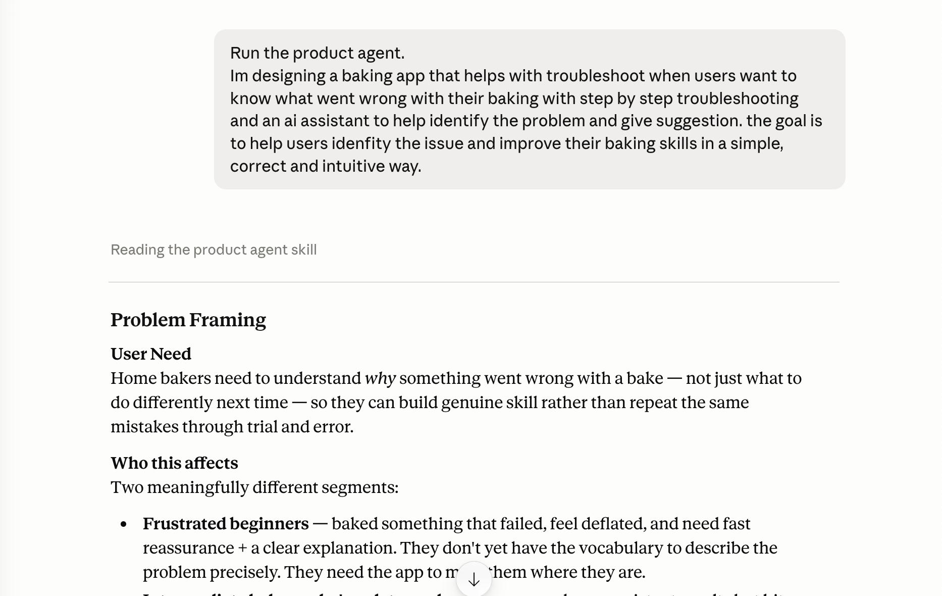
Problem framing output
Two User Segments Identified
Frustrated Beginners
Deflated, need reassurance and plain language. Don't have the vocabulary to describe the problem. They fail twice — once in the oven, and again when trying to explain what went wrong.
Intermediate Bakers
Want the science behind the fix, not just the fix. They'll find hand-holding patronising — they need depth, not reassurance.
Design Opportunity
How might we guide bakers to become better observers of their own bakes, so that troubleshooting is itself a skill-building lesson?
Step 2 — Design Direction
With the brief confirmed, I asked Claude to propose three structurally distinct directions — not just visual styles, but different fundamental models for how the diagnostic flow would work.
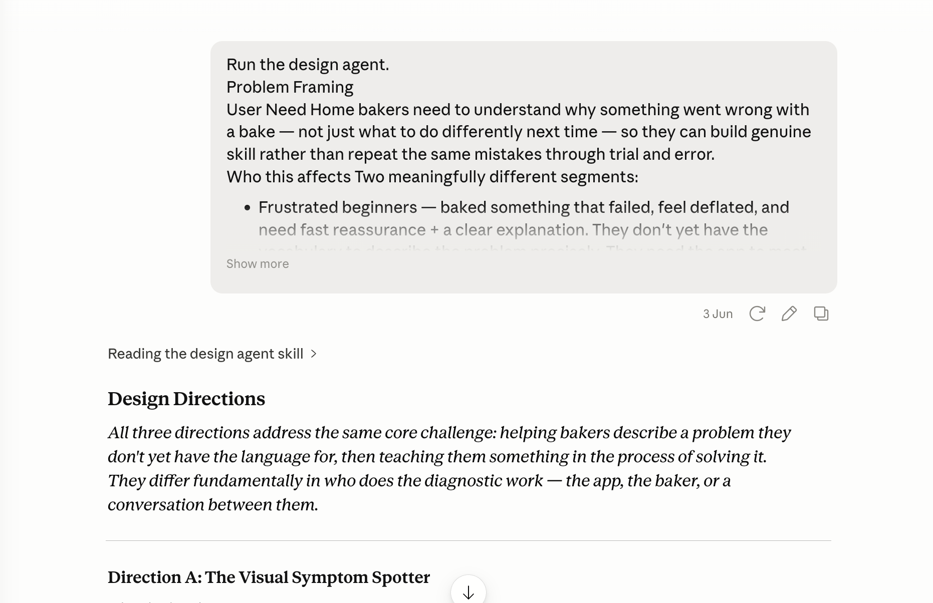
Design direction summary
Three Distinct Directions
Visual Symptom Spotter
Users identify their problem by tapping a photo rather than finding words. No typing required.
Trade-off: Strong for beginners, breaks down for flavour problems and compound failures.
Guided Investigator
One question at a time, each with embedded micro-copy explaining why it matters. The structure of the questions is where the skill-building happens.
Trade-off: Slower to reach a diagnosis, but each step teaches the user something.
AI Conversation with Structure
Free-form chat with a hidden diagnostic checklist running underneath. Most natural to use.
Trade-off: Highest risk of an AI hallucinating a confident but wrong diagnosis.
My Decision
Direction B as the backbone, extended with the AI companion from C as a "go deeper" layer, and the photo feature from A as an optional accelerator at the start.
Step 3 — Design System
I chose an editorial aesthetic for a premium food publication feel, and asked Claude to define exact tokens and rules, including specific hex values, typeface pairings, and usage constraints.
Claude's first palette used gold #C9A96E which failed WCAG AA contrast on white (ratio ~2.8:1, minimum 4.5:1) and read as dirty yellow on screen. I flagged this and Claude replaced it with terracotta — warmer, more editorial, and WCAG compliant as a fill.
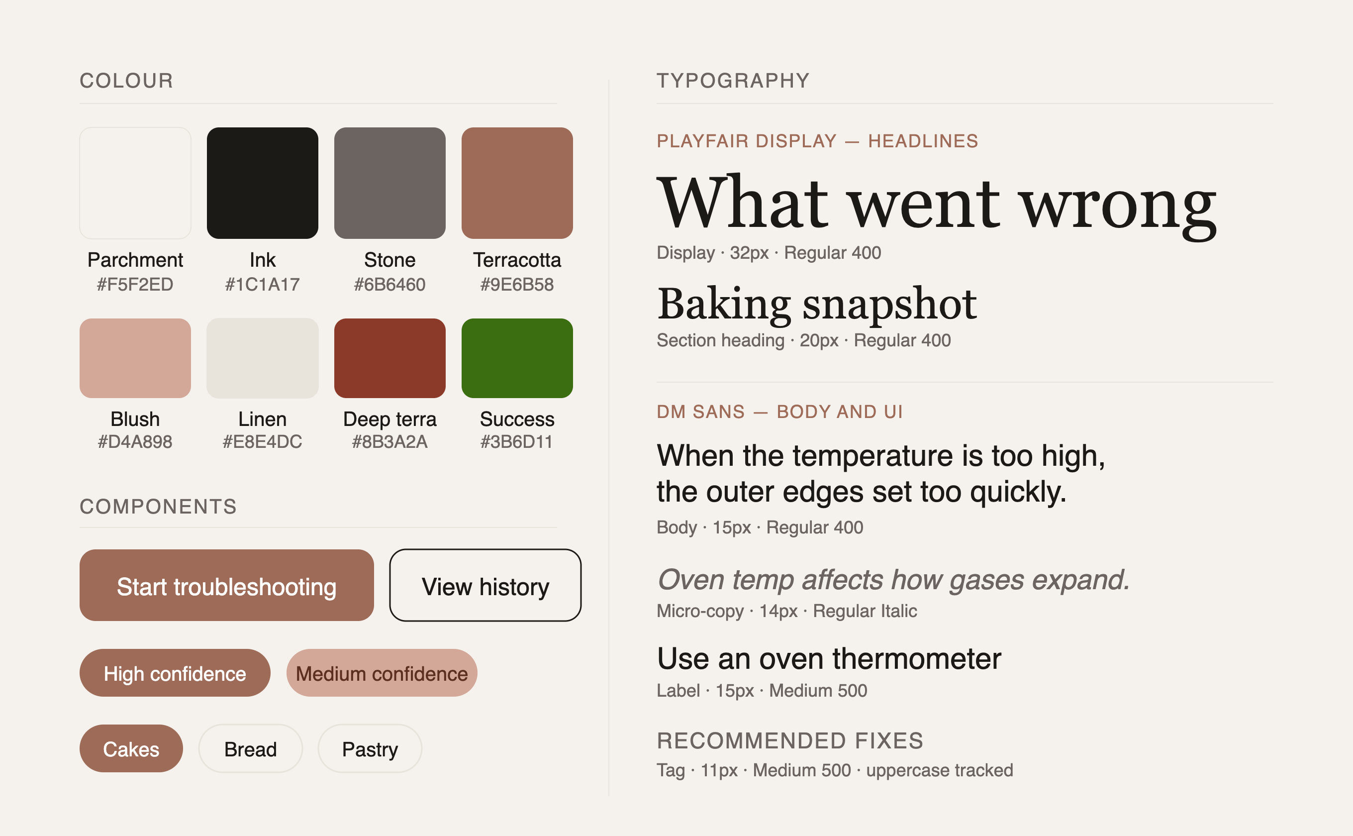
Colour palette and typography specimen
Step 4 — Prompt Engineering
Claude's most practical contribution was translating design decisions into precise, structured Stitch prompts. Each prompt included exact hex codes, pixel values, font weights, component specs, copy examples, and edge states across all 8 screens.
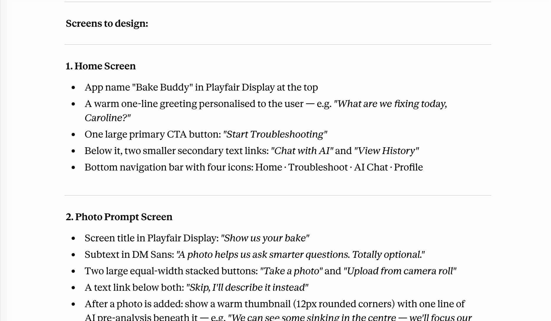
Prompt structure excerpt
Why this matters
Vague prompts produce vague output. Specifying the design details directly determined what Stitch generated.
Step 5 — Stitch Prototype Iterations
4 full generation passes. Each round followed the same cycle: generate → I review screens → ask Claude to audit → Claude produces annotated analysis → I refine the prompt → regenerate.
Round 1
Stitch interpreted the editorial tone well. The parchment background, typography hierarchy, and card layout all landed. But structural issues appeared immediately.
- Gold accent failed WCAG AA contrast (ratio 2.8:1 on white)
- Nav bar active state and button styling inconsistent across every screen
- Bake names in History truncated mid-word
- Stitch added additional content sections not in the spec
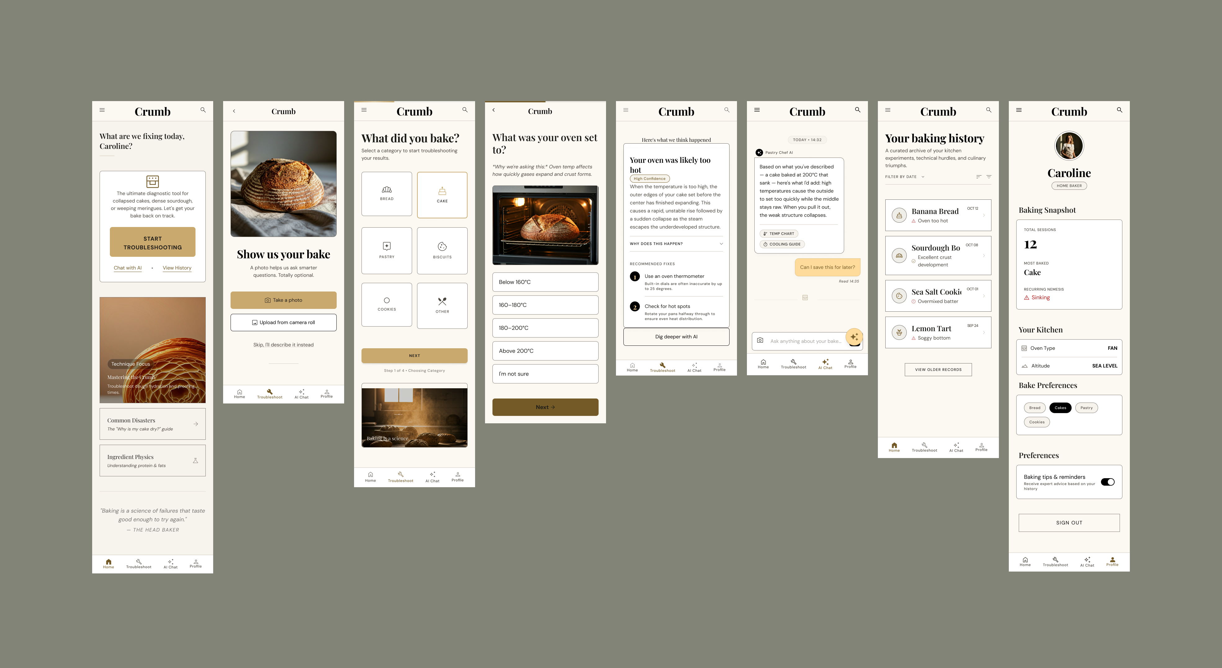
Version 1 — all screens
Round 2
Updated colour system, lighter card borders, AI chat bubble switched to white, primary CTA button corrected.
- No left/right content margins
- Button text inconsistency on several screens
- Home screen still had an unnecessary card wrapper
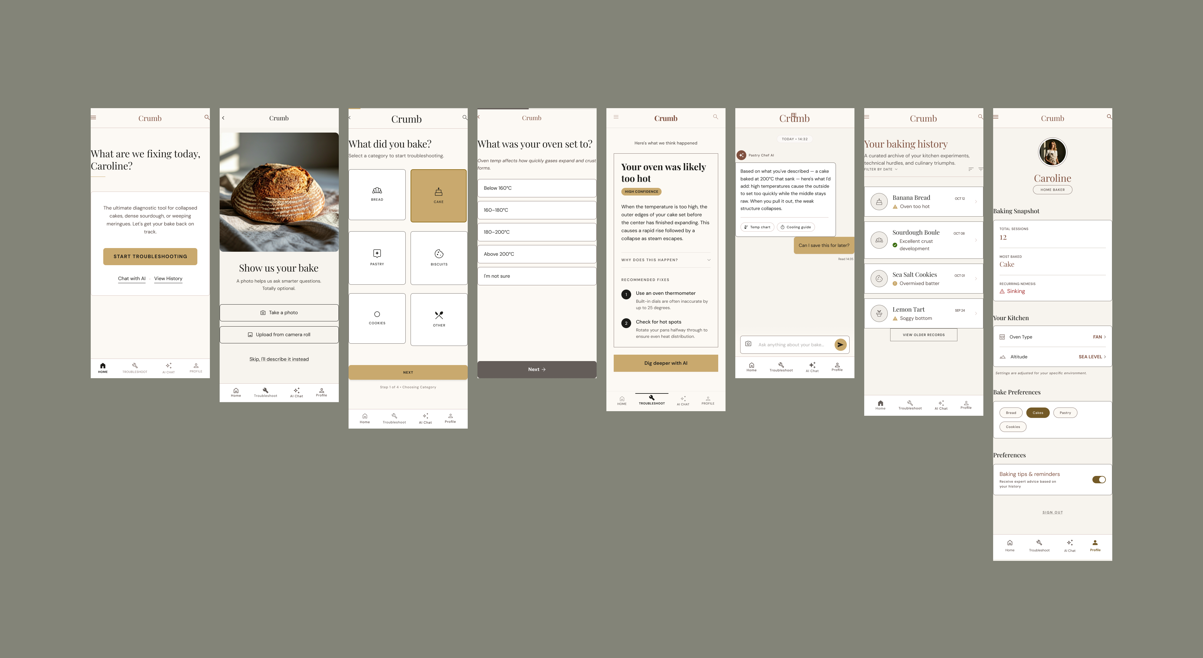
Version 2 — all screens
Round 3
Margins applied, card removed from Home, button text mostly sentence case, colour system consistent.
- Nav labels inconsistent across screens
- Result looked not refined
- Some components felt chunky
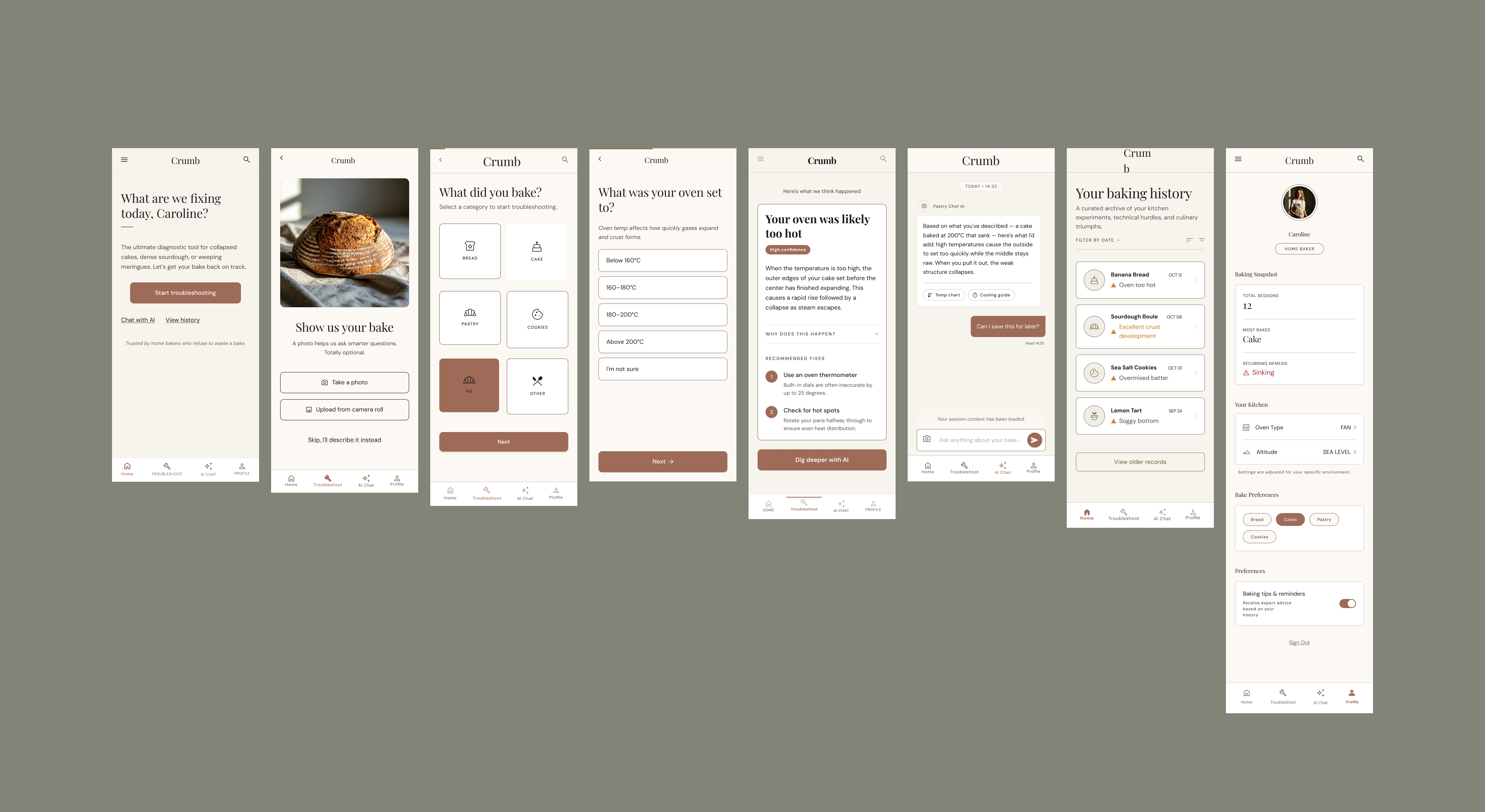
Version 3 — all screens
Round 4 — Inspiration-led refinement
I looked for references in cooking and baking apps and editorial designs. I fed selected examples directly into Stitch and asked it to refine based on those references.
- Nav bar active state still inconsistent across screens
- Heading size and logo scale vary between screens
- Wrong icons on the Bake Category Selection screen
- Small inconsistency on several screens
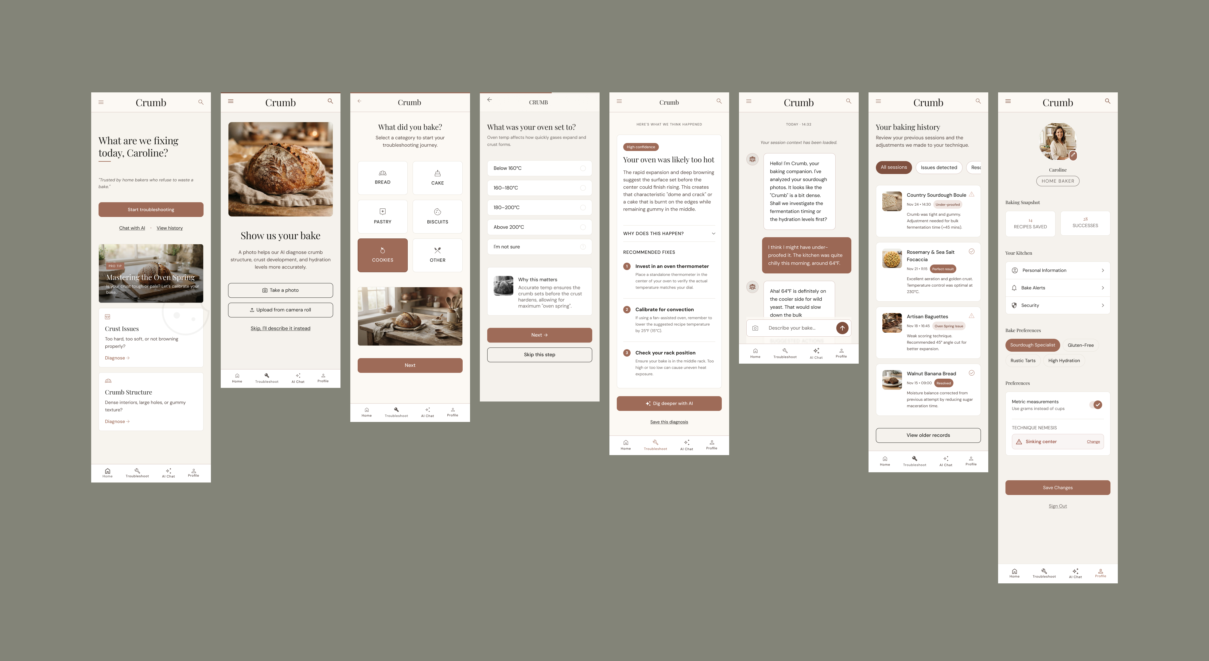
Version 4 — final screens
Critical Reflection
What AI did well
- SpeedProblem framing, three design directions, visual system, and initial prototype generation happened within a single working session.
- Structured promptingClaude translated design intent into precise, multi-screen Stitch prompts more reliably than writing them manually. The prompt quality directly correlated with output quality.
- Iterative auditingClaude's screen-by-screen audits were structured and thorough, catching WCAG failures, spacing inconsistencies, and component misuse across multiple rounds.
- Rapid hi-fiStitch generated a visually coherent hi-fi prototype in seconds, meaning design decisions could be evaluated on real screens rather than wireframes, earlier in the process.
- Visual reference accelerates resultsProviding inspiration examples to Stitch produced a noticeably better output than any prompt had managed. Reference gave the AI a clearer visual target, reduced ambiguity, and aligned output much closer to the goal. The earlier this is introduced, the better.
Where designer judgement was essential
- Stitch doesn't always follow the promptDespite explicit specs, Stitch reintroduced fixed issues across multiple passes. After 4 rounds, some problems persisted. A human working in Figma fixes something once and it stays fixed.
- Claude's audits had blind spotsThe button text inconsistency appeared across several versions before Claude flagged it. I had to cross-check Claude's audits against the actual screenshots myself to catch what it missed. AI analysis is a useful second opinion, not a replacement for a designer's judgement.
- The design system didn't propagateClaude produced a strong, coherent design system. Stitch referenced it in every prompt. But Stitch applied it inconsistently. A shared Figma component library would have prevented this.
- Icon accuracy requires curationStitch generated contextually wrong icons. Iconography needs to come from a proper icon library, not generative output.
Next Steps
 HANDOVER TO FIGMA
The Stitch prototype is now being rebuilt in Figma. Priority fixes include a full WCAG contrast audit, and fixing all inconsistencies. Once it's ready, the next phase is user testing with home bakers.