Mobile Application
UQU App
A platform that centralises student services and events to boost engagement at university.
Overview
The Challenge
The UQ Union is a student organisation dedicated to providing a range of services to students at The University of Queensland. However, due to fragmented information across multiple portals, many students were unaware of the services and events available to them. This led to low student engagement and high frustration when trying to access university resources.
The Solution
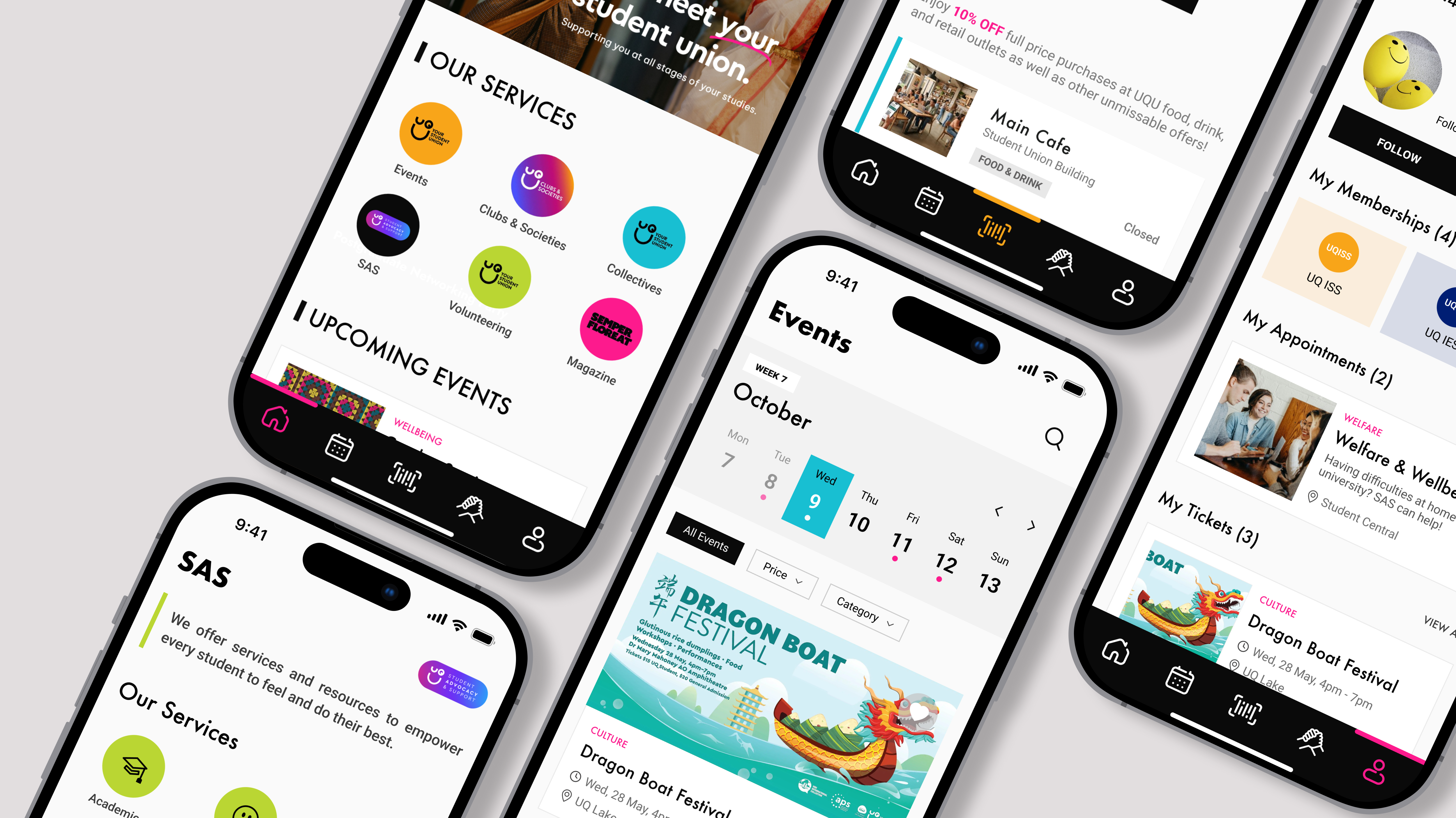
We designed a unified mobile application platform that centralises all student services, club activities, and campus events into one single, intuitive interface. The goal was to boost university engagement, ensure better utilisation of resources, and foster a vibrant campus community by making discovery and participation easier.
Role
UX Researcher, UX/UI Designer
Duration
April 2025
Tools
Figma · Miro · Pen and Paper · Excel
Team
- 2 × UI Designer
- 2 × UX Researcher
- 1 × Developer
Research & Discovery
As UQ students ourselves, we started with our own experience. The frustration we all shared was the same: UQU's events and services are scattered across Instagram, Facebook, and a handful of third-party links, which makes them hard to find and access.
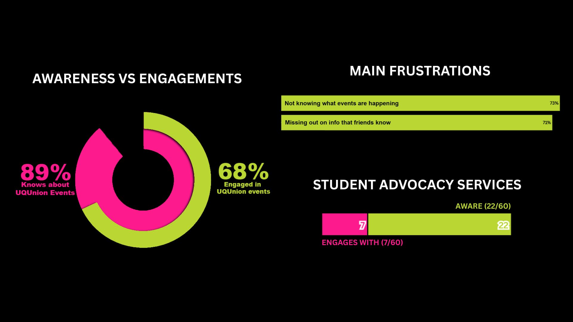
To back this up with broader data, we ran a survey with over 60 students.
KEY INSIGHTS
Awareness vs. Action
Most students are aware of UQU events, but engagement rates remain relatively low.
Service Blindspots
Only a small portion of students are aware of and engage with Student Advocacy & Support.
Discoverability Need
There is a need for improved discoverability and accessibility to boost participation in events, services, and activities.
That surfaced our core design challenge. With so many features to potentially include, we had to make sure the valuable features are easy to find without overwhelming them with options. Finding that balance between accessibility and focus became the throughline for every decision we made.
Feature Roadmap
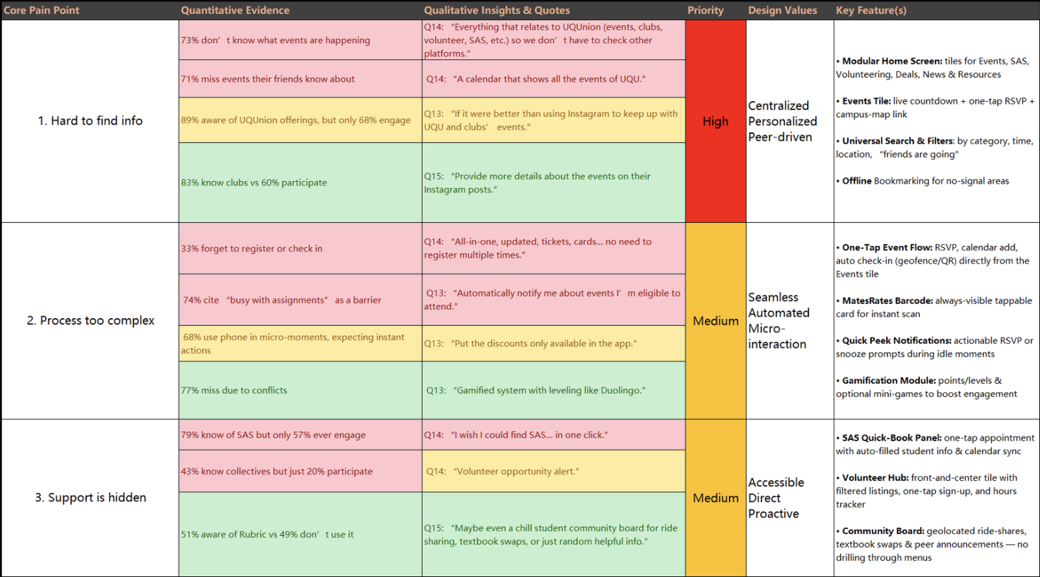
From the survey results, we pulled out the recurring pain points and grouped them into themes, such as things like information being hard to find, processes feeling unnecessarily complex, and support services being hidden where students wouldn't think to look. From there, we mapped each pain point against its priority and values, which gave us a clear basis for deciding what features to build first.
User Persona
Alex Kim
The Overwhelmed Engager
"I know UQU does a lot, but I never know where to look — by the time I find out about something, it's already over."
GOALS
- —Discover and join campus events to build social connections
- —Access student services and welfare support in one place
- —Stay informed about affordable food options and UQU perks
- —Find and attend events that friends are already going to
PAIN POINTS
- —Services are scattered across multiple platforms
- —Unaware of many UQU offerings beyond basic events
- —Busy schedule leaves no time to hunt for information
- —Lack of reminders means events are discovered too late
NEEDS
- —A single centralised app for events, services, and clubs
- —Personalised notifications and smart recommendations
- —Simple interface for quick access without a learning curve
- —Seamless RSVP, club joining, and welfare support access
BEHAVIOURS
- —Discovers most events through word of mouth or friends
- —Checks phone frequently but ignores non-personalised alerts
- —Prefers mobile-first experiences over desktop or email
Proposed Solution
Our goal was to design a mobile app that brings everything together in one place: events, services, clubs, welfare support, and campus resources.
Discoverability
Making every campus event and service easy to find from a single centralised interface.
Accessibility
Ensuring all platform features and vital welfare support systems are easy to access for every student.
Engagement
Creating a unified digital campus environment that actively encourages student participation.
KEY FEATURES
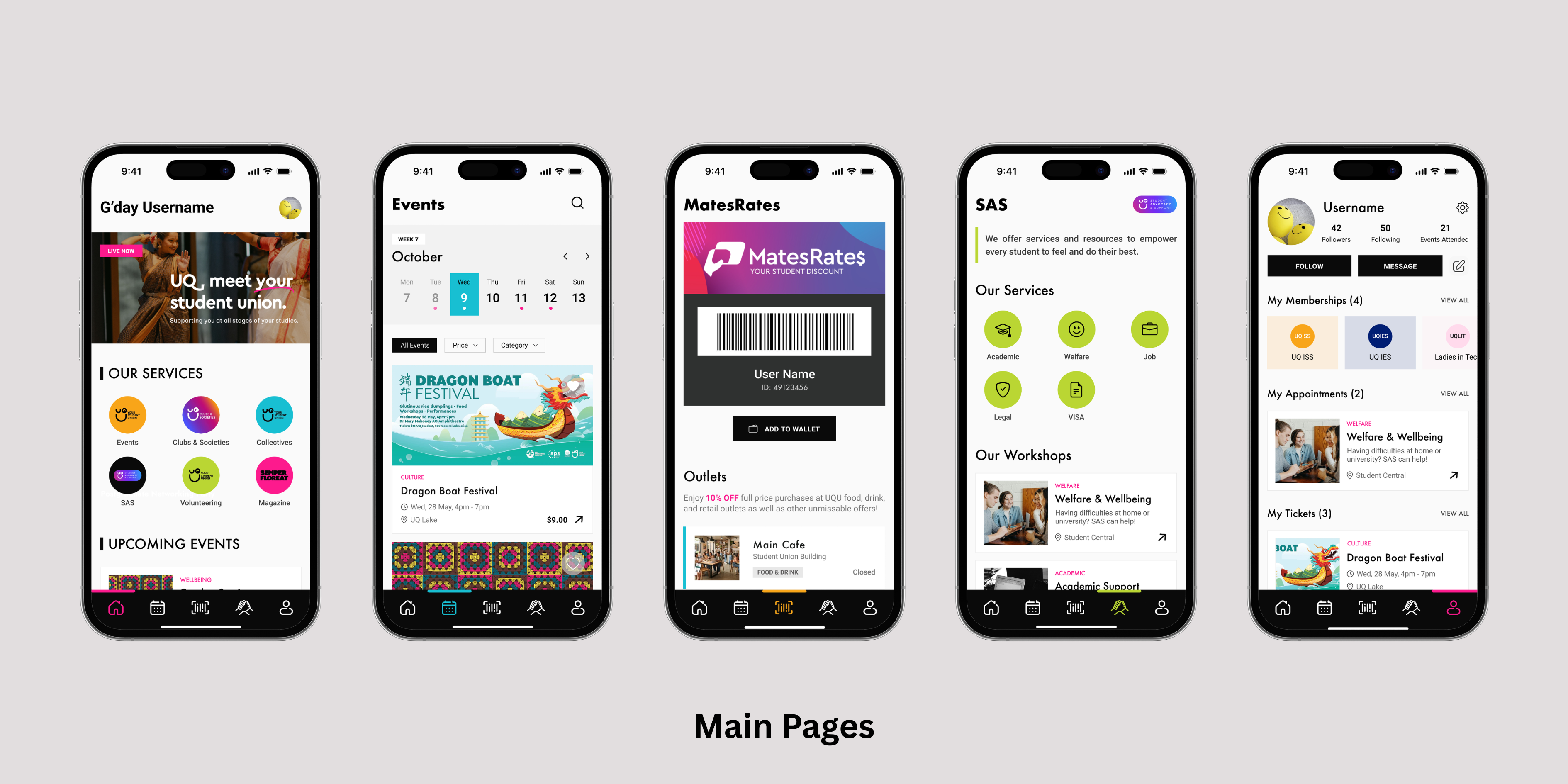
- Modular Home ScreenEasy access to key services like events, student advocacy services, volunteering, deals, news and resources.
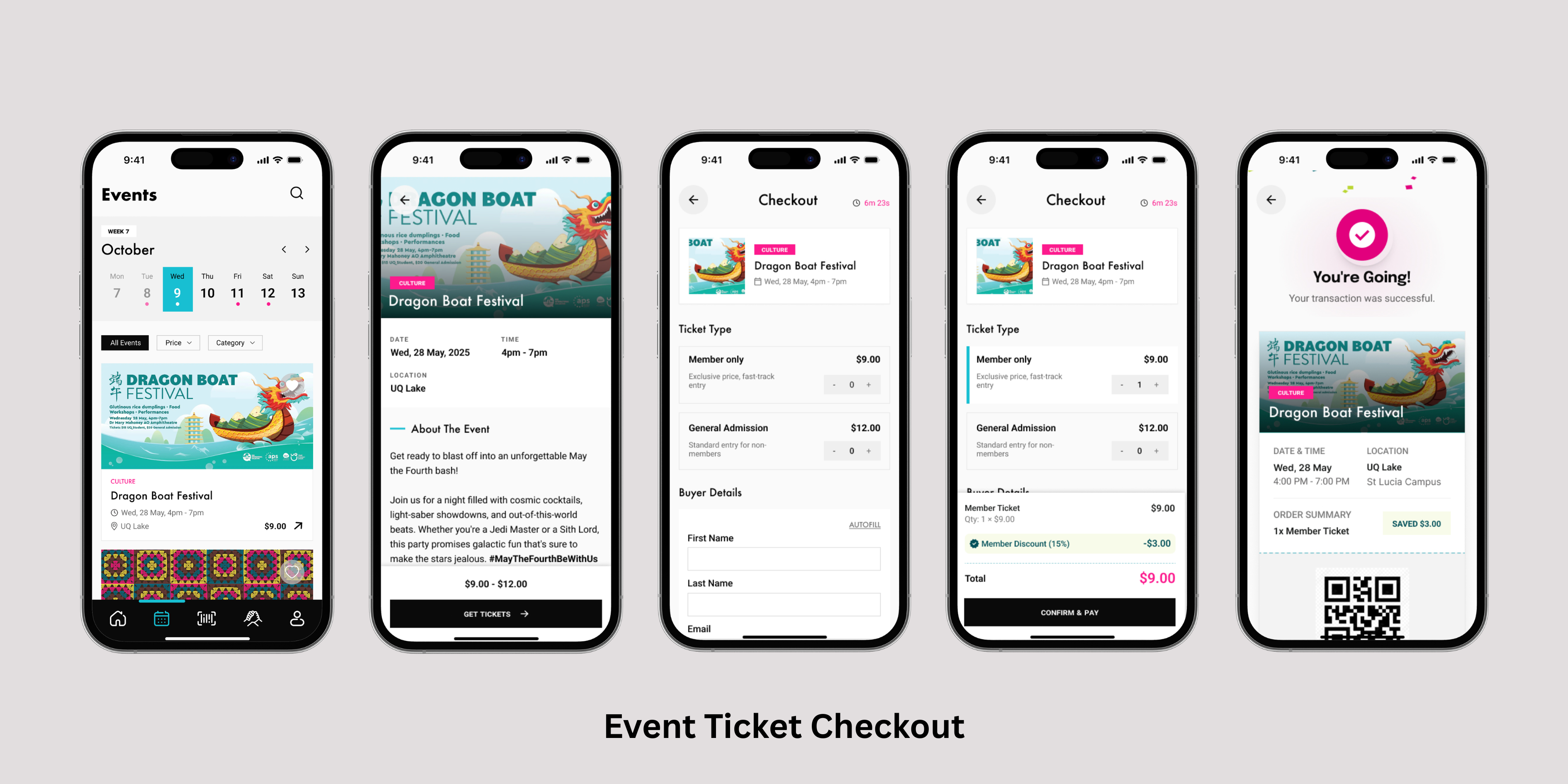
- Event CalendarSearchable calendar with filters, RSVPs, and reminders to boost participation.
- MatesRates BarcodeAlways-visible tappable card for instant scan to buy discounted products on campus.
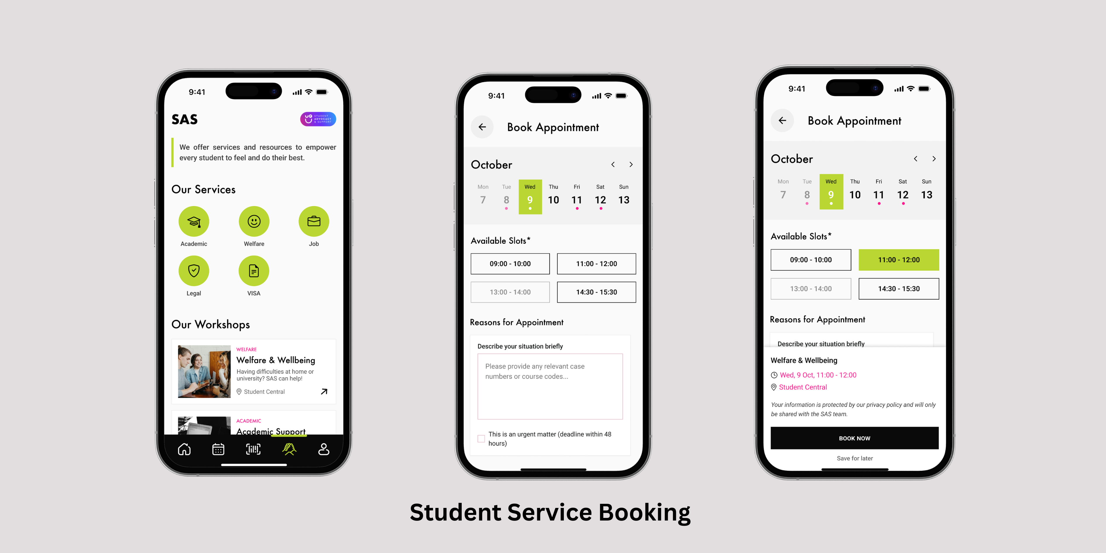
- SAS Quick AccessQuick links to welfare, support, and other resources with in-app navigation.
- Notifications and AlertsPush notifications for upcoming events, deadlines, and promotions.
Design Guide
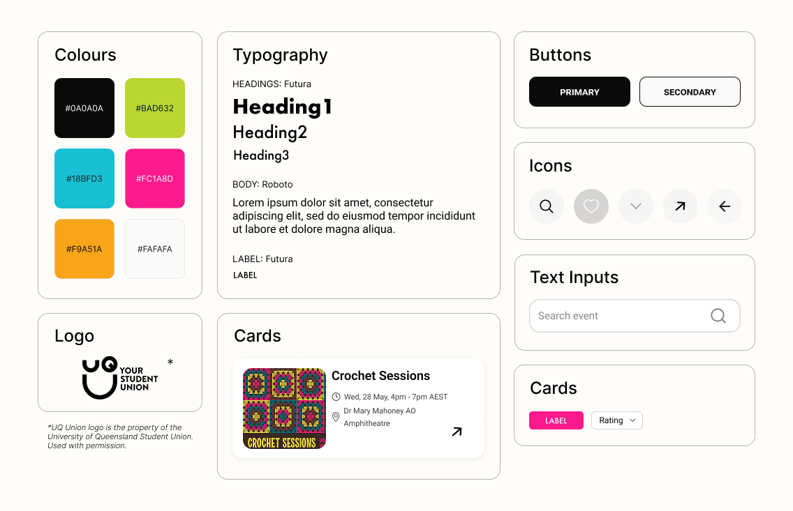
The colour palette was drawn directly from the UQ Union's existing branding. The colours feel vibrant and engaging for uni students demographic. For typography, we used a combination of Futura and Roboto fonts to create a modern, clean and accessible look.
High Fidelity Prototype
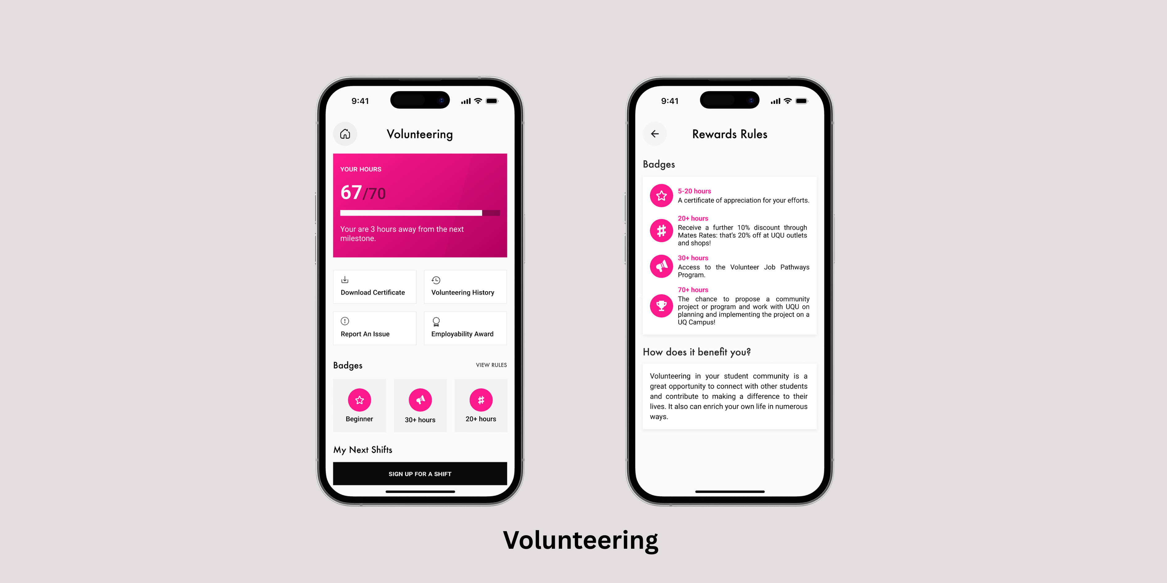
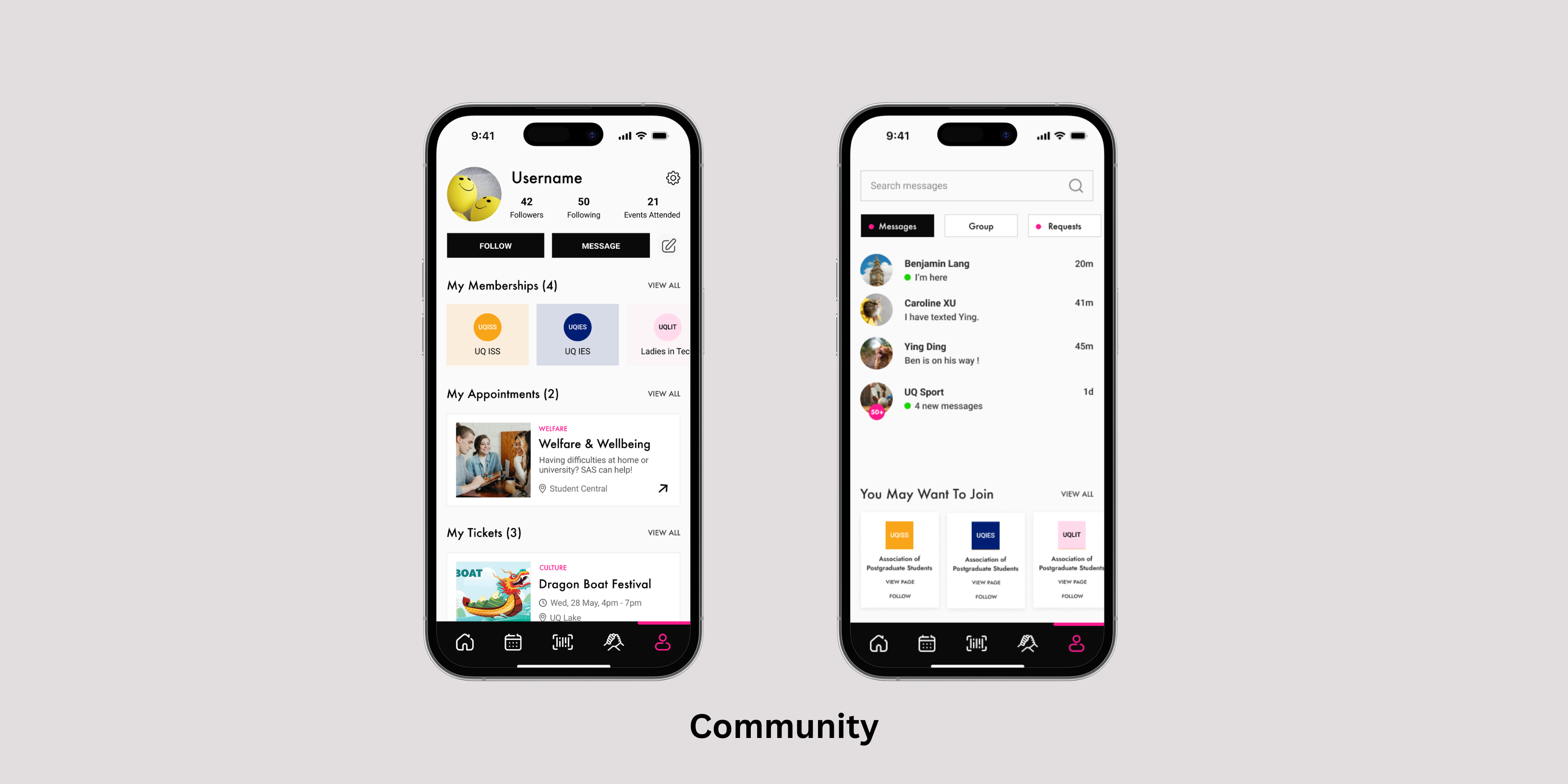
For the final high-fidelity prototype, we prioritised key UQU services, high legibility, and a clear visual hierarchy to ensure the app felt simple to use.
User Testing
We conducted a moderated usability testing session with think-aloud method with 5 students to validate the design. Each participant was asked to complete a series of tasks independently.
TASKS GIVEN
- Locate a social event happening this weekend
- RSVP and add the event to your calendar
- Find the booking page for academic advising
METRICS TRACKED
- •Time on task
- •Task success rate
- •Ease of use (self-reported, 1–5 scale)
- •User satisfaction (post-test rating)
Outcome
Overall, participants were satisfied with the design. They appreciated the centralised access and easy navigation, noting it would increase their engagement.
While the overall feedback was positive, some participants felt a bit overwhelmed by the variations in colour use (to reflect UQU’s diverse branding), so for iteration, we would use neutral colours like black and white as the primary colours and use the accent colours sparingly.
Key Learnings
Designing the UQU App taught me how to balance incredibly dense structural information in a mobile environment without cognitively overwhelming the user. Through research and testing, I learned the importance of making all features easy to find while giving priority to the ones users value most.