Responsive Website
Accounting Firm Homepage Redesign
Redesigning the mobile banking experience to improve usability and accessibility for all users.
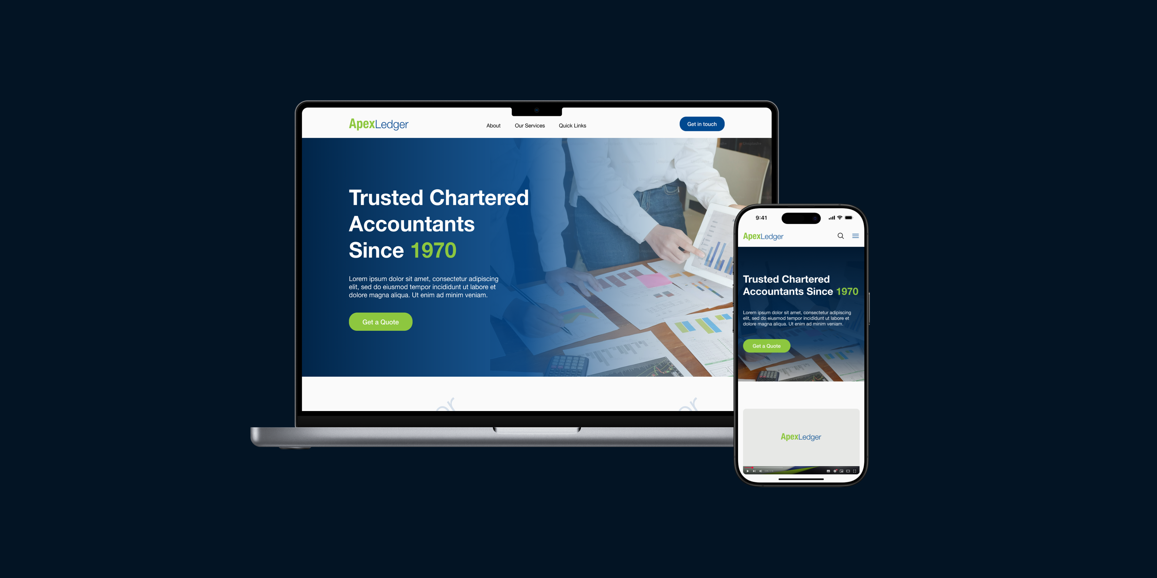
Overview
The Challenge
The existing accounting firm website had an outdated design that failed to meet modern user expectations, with poor navigation, lack of clear calls-to-action, and disorganised content, and zero responsiveness, which greatly hinders user engagement and trust in the firm's professional services.
The Solution
I led a complete redesign focused on establishing a trustworthy digital presence. By conducting heuristic evaluations and iterative wireframing, I created an intuitive, accessible interface that clearly communicates the firm's value and streamlines client contact.
Role
UX/UI Designer
Duration
1 month (Oct 2025)
Tools
Figma · Pen and Paper
Team
- 1 × UX/UI Designer
Research & Discovery
As this was a self-initiated trial project without formal user testing, I conducted a heuristic evaluation based on Nielsen's 10 Usability Heuristics and supplemented it with an informal competitor analysis of modern accounting firm websites to benchmark against industry standards.
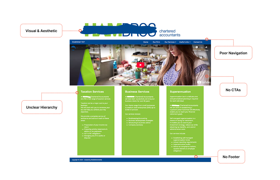
- 1Visual & Aesthetic: Outdated UI and oversized logo disrupt the Aesthetic-Usability Effect and reduce brand trust.
- 2Navigation: Poor navigation structure and lack of clear CTAs and contact forms lead to increased bounce rates.
- 3Content: Disorganised content and lack of clear hierarchy make it difficult for users to find the information they need.
- 4Responsiveness: Non-responsive design and lack of footer/styling on subpages break web standards.
Proposed Solution
The goal was to redesign the homepage to create a modern, trustworthy, and mobile-friendly user experience that clearly communicates the firm's value proposition, improves navigation, and streamlines user journeys for potential clients to get in touch.
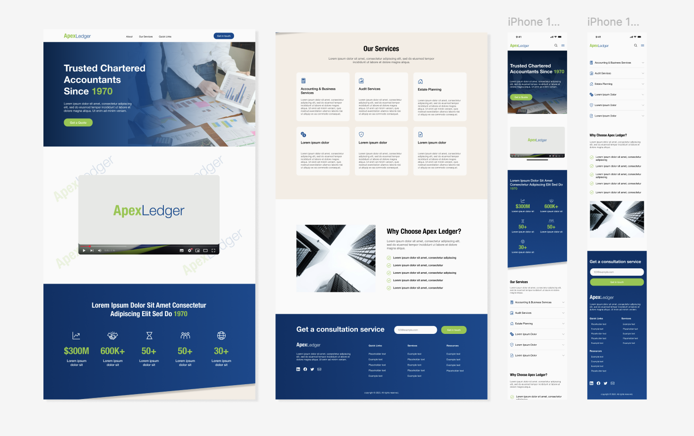
- Hero Section with Tagline and CTAA concise introduction and prominent 'Contact Us' button.
- Structured Content SectionsOrganised content into clear, scannable sections with ample spacing and visual hierarchy.
- Modern Visual IdentityA cohesive design with a professional color palette and legible typography.
- Improved NavigationBalanced header with a visible navbar and smaller logo, and a footer with quick links and contact information.
- Responsive DesignEnsured all content is fully responsive and accessible on mobile devices.
Wireframes
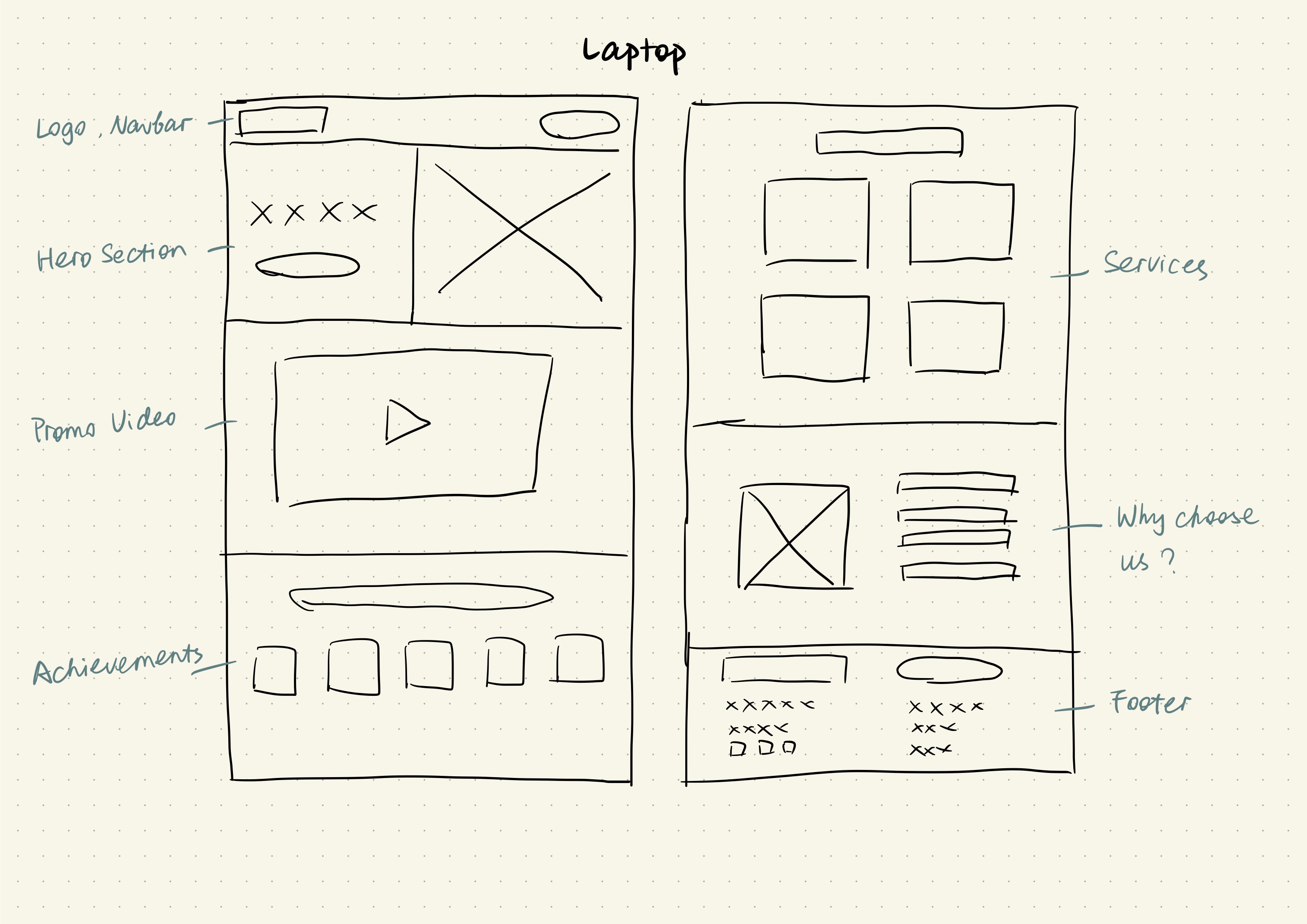
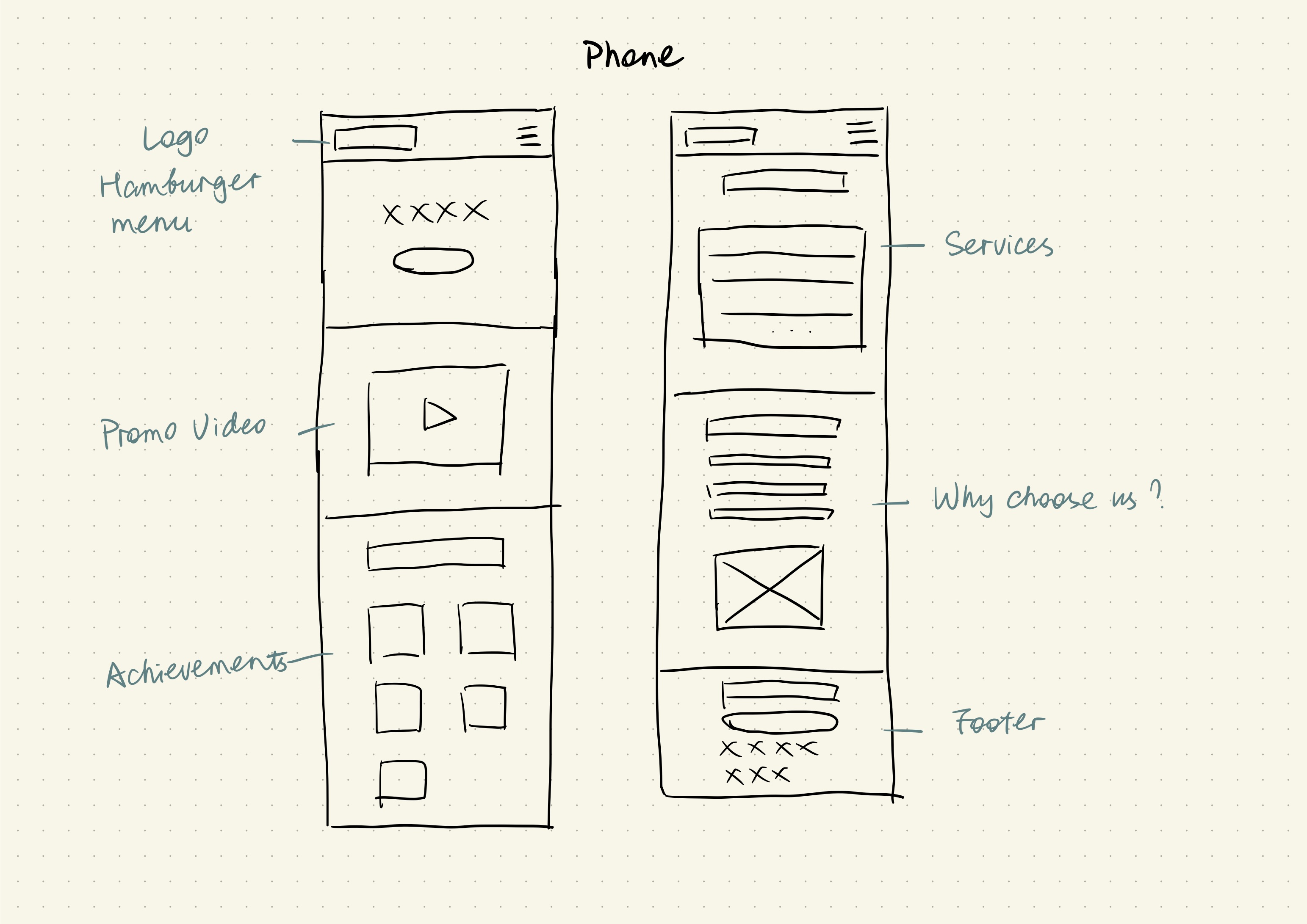
I started with low-fidelity sketches to create the basic layout and content hierarchy to test structural layout functionality.
Design Guide
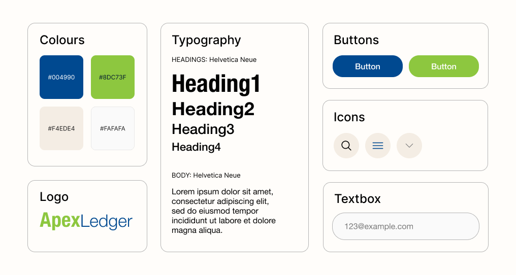
To ensure consistency across the site, I created a lightweight design system including responsive typography scaling, a semantic color palette, and reusable UI components like buttons and form inputs. The colour palette is based on the firm's branding to convey trust and professionalism. I chose Helvetica Neue as the primary typeface for its clean, modern aesthetic and excellent readability.
High Fidelity Prototype
I incorporated feedback from self-review to enhance readability and usability. I focused heavily on whitespace, typography, and contrast to ensure a clean, modern aesthetic that feels inherently trustworthy and professional.
User Testing
I conducted a small unmoderated usability testing with 5 participants to validate the new navigation and content structure. Each participant was given a scenario: visiting the site as a potential new client seeking accounting services for the first time, and asked to complete a series of tasks independently, without guidance.
TASKS GIVEN
- Locate the primary contact or booking button
- Find information about the firm's services
- Assess whether the site feels trustworthy and professional
METRICS TRACKED
- •Time on task
- •Task success rate
- •Ease of use (self-reported, 1–5 scale)
- •User satisfaction (post-test rating)
- •Perceived trust and professionalism (1–5 scale)
Outcome
Across all five sessions, participants navigated the redesigned site with confidence. The results validated my design decisions around hierarchy, trust signalling, and CTA visibility.
Key Learnings
This trial redesign enhanced my ability to apply heuristic evaluations to identify usability issues. By applying design principles like visual hierarchy, white space, and consistency, I transformed an outdated homepage into a more engaging and professional interface.
- Trust is built through design consistencyNot just content, visual coherence signals professionalism before a user reads a single word.
- Small changes create big impactAdding clear CTAs and taglines significantly improved the experience and conversion potential for a service-based business.
- Heuristic evaluation is a powerful toolIt gave me a structured, repeatable way to identify usability issues with confidence rather than guesswork.